The principles of graphic design are like building blocks. Each one layers on top of the other until you’re left with the foundation for creating something incredible—whether you’re designing a logo, a website, or a custom illustration. If you want the lowdown on all the graphic design basics, you’ve come to the right place because we’re going to cover them all.
Let’s take a look at what you need to know to make all of your designs rock:
Learn the 8 graphic design basics
—
• Space
• Balance
• Hierarchy
• Lines and Shape
• Color
• Typography
• Texture
• Branding
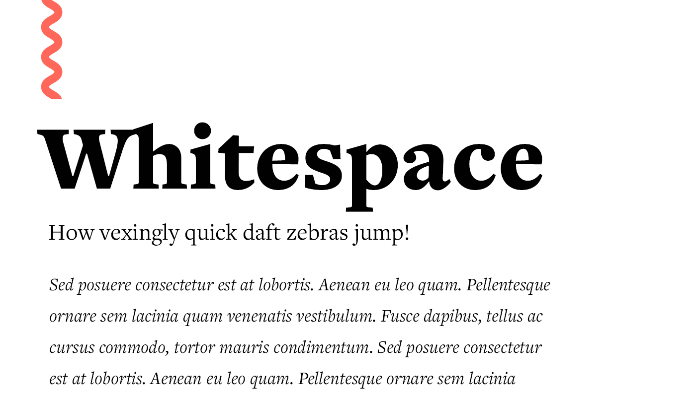
Space
—
You know that peaceful feeling you get when you’re in a gorgeous, wide open space? Well, graphic design works the same way.The best designs aren’t the ones that try to fit every design element on the block into a single composition. They utilize open space to bring attention to the elements that actually matter.


Balance and alignment
—
When it comes to design, you can definitely be creative, but you also have to be balanced. Think of it like this: if you were decorating your living room, you wouldn’t try to squeeze the sofa, the recliner chair, the coffee table, and the end tables all into a tiny corner, right? No, you’d spread the pieces throughout the room to create balance and alignment. With graphic design, it’s exactly the same.


Hierarchy
—
You’ve figured out how to use space and balance. But how do you draw attention to your key elements and make sure your messaging doesn’t get lost in the shuffle?
Hierarchy is how you present the elements on your design (whether it’s a brochure, a website or a business card). This directs viewers to where they should focus their attention. As a general rule of thumb, the larger the design element, the more attention-grabbing it will be.
But there’s a lot more to visual hierarchy than “bigger is better.”


Lines and shapes
—
Lines and shapes form the foundation of your designs, and how you use them can completely transform how a design looks and feels.
For example, a design that’s all rounded edges will send a very different message than a design that embraces sharp lines. Understanding the meaning of lines and shapes is crucial for creating designs that are in-line with your brand, vision and messaging.


Color
—
Color is so much more than the rainbow assortment of hues in a bag of Skittles. Color is influence. Color is power. Color drives engagement. But only if you know how to use it.
The colors you choose for your designs are crucial not only to your overall aesthetic, but to how well your designs connect with your audience (which ultimately drives results).


Typography
—
The words you use in your designs are important, but so are the fonts you use to communicate those words.
Typography covers everything from font selection to font layout. Not only does it communicate your core message, but it also communicates a lot about who you are and what you’re about. That’s why it’s important to get it right.


Texture
—
Texture is a surefire way to add depth and dimension to your designs, which makes them more visually engaging.
Whether you add an actual 3D element to a printed piece like a business card or create the illusion through design, texture makes your designs even more memorable. But it’s a tricky thing to get right. If you don’t nail the texture, your design may feel busy or overwhelming—and that’s never what you’re going for.


Branding
—
Branding is how you bring your business, products, services and story to life. How do you do that? By leveraging all of the graphic design basics we’ve covered in this guide to build a brand that feels true to who you are.


Comments
Post a Comment